Welcome to Part 2 of Mistakes I’ve Made: Surveys. In this series, I’m sharing what I’ve learned about surveys in the past few years so you can learn from them.
In Part 1, I shared some challenges with phrasing questions, especially ones that seem like they should be simple. Today, I’ll be covering what I’ve learned about the format / layout and in Part 3 I’ll cover the delivery of surveys.
Format / Layout
Most of the surveys I’ve created were designed to be done in person and on paper. Paper surveys are great for low-tech visitors and sites without wifi but they are inflexible when it comes to their appearance.
The three biggest lessons I’ve learned from creating surveys:
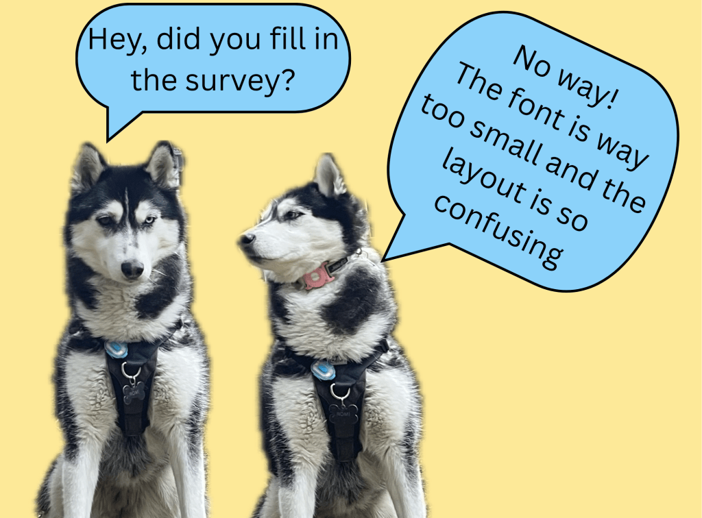
Use a big enough font size.
If your respondents need to pull out their reading glasses to fill in the survey, the font is likely too small.

A couple of years ago I created a survey with too many questions to comfortably fit on one page. I did everything I could to make them fit: I printed them on legal size paper (8.5” x 14”), instead of letter sized paper (8.5” x 11”), I made the survey layout in Adobe (instead of Word) to fit as much in as possible and I removed any unnecessary text.
Unfortunately, that still wasn’t enough to get all the questions onto one page so then I decided to shrink the text. I think it might have ended up around Arial size 10 or even 9 (the shame!). Finally all the questions fit onto the page. Pretty quickly I realized that many people struggled to read it. Visitors would have to root around their bag for reading glasses, borrow glasses from someone else or would even read questions aloud to answer them with others in their group. I had at least one potential respondent opt in to the survey but then had it back once they saw the font size because they didn’t want to get their glasses out!
While using a smaller font size did get all the questions onto one page, it added a barrier to participation. If I could do it again, I’d just find a question to cut or accept that this was going to be a two-page long survey.
Thankfully this isn’t often an issue with online surveys, but it’s still important to make sure your font is big enough for the screen you expect the visitors to be using (tablet, phone, etc.).
Limit branching.
Survey branching – or conditional branching – is when respondents take different paths through a survey so they only answer the questions that are relevant for them.

For example, a respondent who indicates they are a first-time visitor would skip any questions about a previous visit and a respondent who reported visiting alone would not be asked about who else is in their group. Branching is an efficient way of getting respondents through a survey as quickly as possible.
Branching works great online, since you can set up the survey to skip irrelevant questions based on the visitor’s responses but on paper, there is nowhere to hide. You need to list all the questions. So, if you must do survey branching, on a paper survey, try to limit it to one or two branches. Use visual cues, like arrows, to guide respondents to the next relevant question and give your survey layout more ‘room to breathe’ so the branching is easy to see.
Branching is a great way to limit survey fatigue but it can look overwhelming on paper, so use it sparingly.
Keep patterns consistent.
This one seems easy, but it’s the one that tripped me up the most. I knew it was important to keep the rating scales the same (i.e. 1 = very bad, 5 = very good) and to use consistent phrasing for the questions but I missed a bigger pattern and it affected the accuracy of the responses.
A few years ago I created a survey that included both closed response (think scale rating or multiple choice) and open response questions. The first section of the survey included a few questions that were closed and open response questions paired together, so I could get a more robust understanding of the visitor’s response.
For example:
3.a How satisfied are you with your experience on a scale of 1 – 5?
4
3.b Please share some reasons why you chose the rating above.
I like this museum a lot but was a little bummed that we missed the tour today.
While answering these questions, visitors got used to the pattern of answering a closed response question and then providing more information on that response in the next question.
You might be able to see where this is going.
In my naivety I assumed that visitors would be reading each question before answering it. Sadly, no. Many were skimming the questions and they got used to the pattern I had set up: closed response question followed by open response question on the same topic.
Later in the survey I asked closed response and open response questions that were not paired together.
For example:
8. How easy was it for you to use the interactive on a scale of 1 – 5?
3
9. What message(s) stood out to you the most, about the interactive?
It was ok but I would have preferred some more instructions.
It took me a while to notice but many visitors were relying on the pattern that had been set up at the start of the survey and they were answering these questions as if they were paired.
The lesson I learned here is that patterns are powerful – and never assume a survey respondent will read a question.
Thankfully none of these mistakes have ever been so significant that they affected the overall results of the visitor study, but they were all important lessons (that I don’t want to learn again).
In Part 3 I’ll dive into the pitfalls of delivering surveys both online and on paper.
Learn more about surveys in these beginner friendly courses designed for museum and heritage professionals:
